Redesign of the eCommerce platform for Blundstone for the 150th anniversary of the brand in just 2 months increased online awareness with the WordPress web developer’s services by RaiseTech

Business context

We delivered
How the services of RaiseTech, a WordPress website development company, helped the famous Australian shoe manufacturer Blundstone design a website in honor of the 150th anniversary and thereby doubled the audience?

Blundstone, one of the most popular shoe brands in the world

Blundstone is a leading manufacturer of slip-on shoes. The company was founded in 1870 in Tasmania, where its head office is now located. The assortment includes women's, men's, and children's shoes, and a separate category includes boots for work and travel. The brand's products are exported to more than 20 countries worldwide. Blundstone has approached RaiseTech with a request to redesign the site in honor of the brand's 150th anniversary. It was required to tell the story of the company and its advantages in an interesting animation format. And to achieve the WOW effect! The main difficulty was in the tight deadlines: it was necessary to develop a brand project for a maximum of 3 months in order to be in time for the anniversary.

Problems on the way to the ideal

RaiseTech specialists began work on the brand project by studying the company's activities and history, starting from the moment of its foundation. And it is not surprising that it took a huge share of time: for 150 years of being in the Australian, and then in the world market, the company experienced the Great Depression, world wars, and global changes in the fashion industry. Blundstone had a lot to tell its audience. At the same time, the large amount of content complicated the process of organizing the internal structure of the site. The RaiseTech team faced a difficult task: to make the site attractive and informative but not overloaded with text and visual details. To accomplish our missions, we decided to develop an eCommerce website using WordPress.

A corporate website that really immerses you in the company’s life

A team of 5 specialized IT specialists worked on the website redesign:

Not just an online store: a comprehensive eCommerce solution considering the specific needs of the manufacturer

For online store development, RaiseTech allocated a team of 5 people:
  • Project Manager who was responsible for coordinating tasks with the customer and fully controlling the progress of the brand project.
  • Designer, who developed the visual layout of the site following the customer's requirements and the event.
  • Front-end WordPress website developer who created an attractive user interface, taking into account the specifics of the approved design layout.
  • Back-end WordPress web developer who set up the algorithm of the site and brought the functionality to perfection.
  • QA engineer who provided quality control at all stages of design and creation of the site.
The implementation of the brand project took only 2 months, during which the team worked through all the weaknesses of the design and, in fact, created the corporate style of the site from scratch.
Result

Technologies

Wordpress Wordpress
Html5 Html5
Javascript Javascript

Visual update

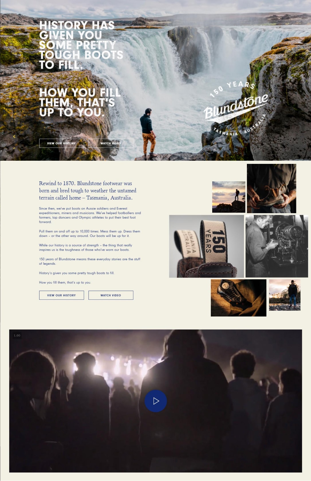
During the analysis of the initial design of the site, it was revealed that it did not correspond to the identity of the company and its corporate standards. The designer carried out an in-depth study of modern design trends and developed a layout considering the current circumstances and the site’s theme. Based on the main task of the project, to tell the audience about the company in a non-standard format, it was decided to decorate each block with bright graphic animated elements. The emphasis on visual brightness helped us present the company in a favorable light and increase the audience's interest and engagement.

Structuring content

One of the main tasks that the team faced was to find a balance between visual and informational components. In the section describing the company's history, the timeline principle was implemented, that is, the page was divided into chronological blocks in the context of each of the 15 decades. For the convenience of moving between blocks/years, a vertical timeline was created. A separate section was dedicated to those who have ever taken part in the company's life, and these are 23 inspiring stories. There was also a place for an advertising component: by choosing a location in the appropriate section, the user got to the site of a local seller. This approach made it possible to place a maximum of information with a minimum of space, make its search and display at the user's request convenient, understandable, and straightforward.

Adaptation for mobile devices

The initial version of the site was not optimized for mobile devices, so the company was losing a huge part of its audience. Our team has made the site mobile-friendly. The complex animation implemented for the desktop version worked stably on all modern mobile platforms. The mobile version made the site easy to navigate for smartphone and tablet users and created additional opportunities for promoting the web resource in search engines.

“WOW” design in 2 months

As a result of working with the design on WordPress, our eCommerce development company managed to create a fully responsive website, which was highly appreciated by users. It contributed to an increase in the company's awareness on the web: its audience doubled after the adaptation of the site for mobile platforms, while the customer return rates noticeably improved.
Minsk

Logoisky tract 37, Minsk 220090, Belarus

+375 293072647 minsk@raisetech.net

Saint Louis

567 Hanley Industrial Ct, BRENTWOOD, MO 63144, USA

+1 314-583-9865 stl@raisetech.net

Minsk Saint Louis
Minsk

Logoisky tract 37, Minsk 220090, Belarus

+375 29 307 2647 minsk@raisetech.net

Saint Louis

567 Hanley Industrial Ct, BRENTWOOD, MO 63144, USA

+1 314-583-9865 stl@raisetech.net